The backend
CivicDataLab's data team was consolidating disparate scheme indicators into a single open-data pipeline.
I designed a Minimum Viable Product (MVP) for an open-data dashboard to help government officials in Assam track regional development metrics in one unified view. By aggregating indicators across multiple schemes into a single platform, the design eliminates platform-switching and simplifies daily data analysis for district officials.
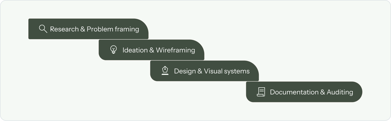
Mentored by Anushka Gokhale (Sr. Product Designer) and collaborating with cross-functional Research, Data and Tech teams, I led the user experience through four key phases.
*Gantt have a real project with clean cut phases
District performance metrics in India are siloed across multiple systems and scheme-centric platforms, making tracking slow and fragmented. Assam was selected as the first state to tackle this challenge.
CivicDataLab's data team was consolidating disparate scheme indicators into a single open-data pipeline.
To design the front-end user experience and help structure raw metrics into an intuitive dashboard for easy browsing.
Through the insights from our research and data science teams, we identified three core user priorities.
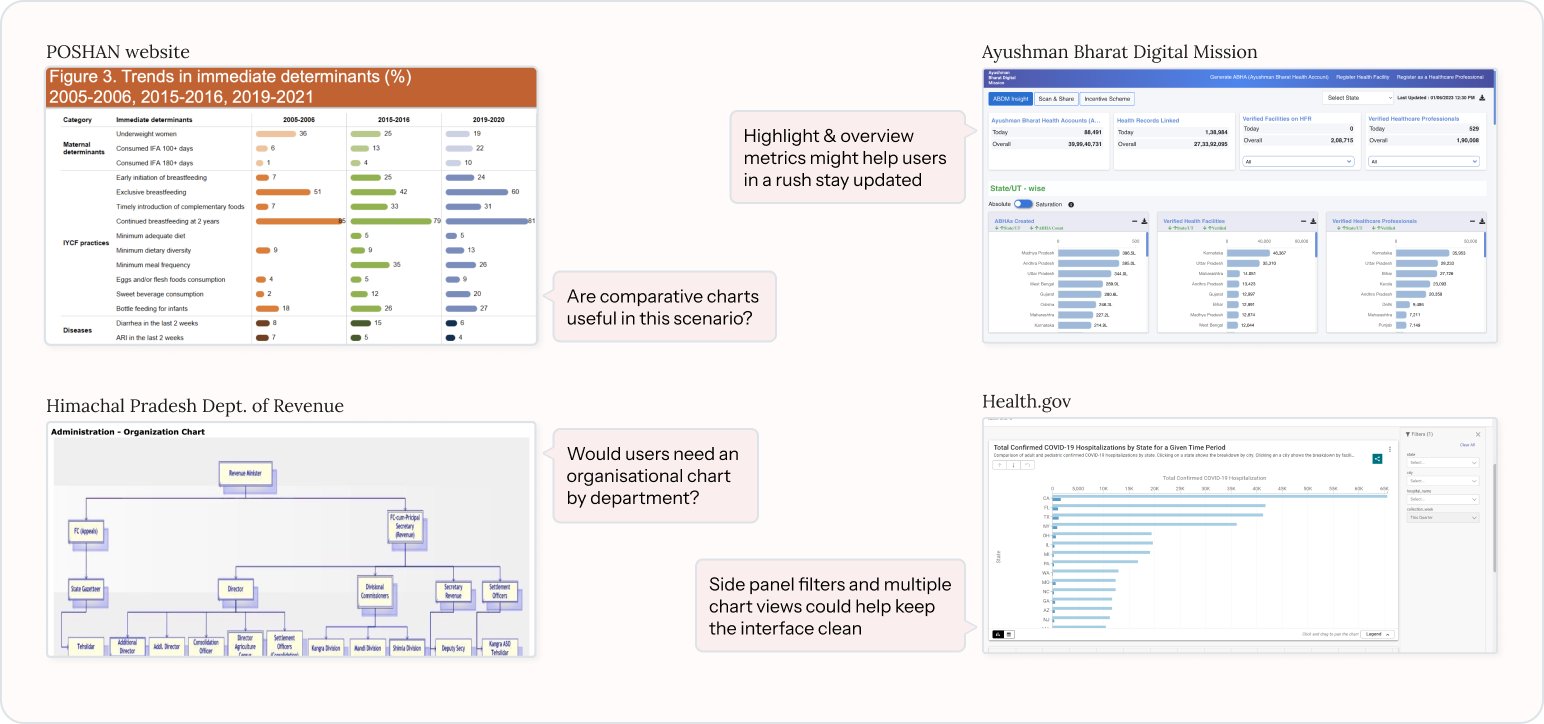
Beyond core functional needs, research showed that our users weren't very tech-savvy, meaning introducing new patterns could create steep learning curves. I benchmarked existing Indian and global dashboards to map the design patterns they are already accustomed to while also framing new questions about platform requirements.
*Snippets of my notes from the mapping
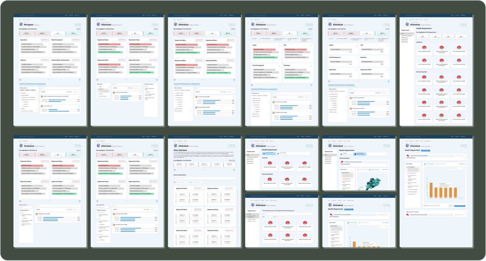
In a quick 3-day sprint, I explored multiple layouts and information flows to test directly with users and identify early friction points.
*Wireframing for government products looks like small decisions with big impacts
Designing alongside an evolving dataset created a two-way feedback loop with the data team to align user desires with technical constraints.
Informing pipelines: UI concepts helped the data team understand what level of granularity was needed in sections like the overview.
Scoping phase 1: Technical limits helped trim complex features into the Phase 2 roadmap.
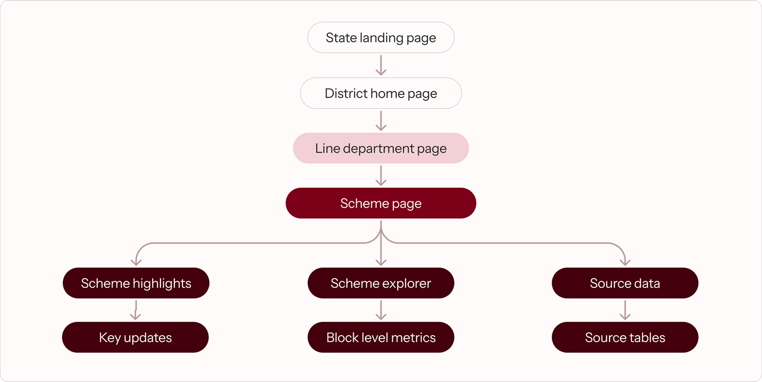
To build a foundation for the interface, I mapped an information architecture that followed a drill-down hierarchy based on the scope requirements.
*A high-level view of the IA
Core problems discovered and how they were solved for.
Phase 2 backlog: Explicitly documented non-MVP features for future roadmap planning.
Design discrepancies: Cataloged UI variations between Figma specs and web implementation.
Validated assumptions: Tracked baseline design assumptions to guide upcoming user testing cycles.
Usage context: Detailed functional guidelines and state rules for each UI component.
Responsive rules: Documented layout adaptations and breakpoint behavior for mobile screens.
Team feedback loop: Captured insights from data teams and end-users to justify layout and IA choices.