District data dashboard hero image

Jul to Oct 2023 • Fellowship project • CivicDataLab

Monitoring district performance shouldn't require 20 open tabs

I designed a Minimum Viable Product (MVP) for an open-data dashboard to help government officials in Assam track regional development metrics in one unified view. By aggregating indicators across multiple schemes into a single platform, the design eliminates platform-switching and simplifies daily data analysis for district officials.

It takes a “district” to make a MVP

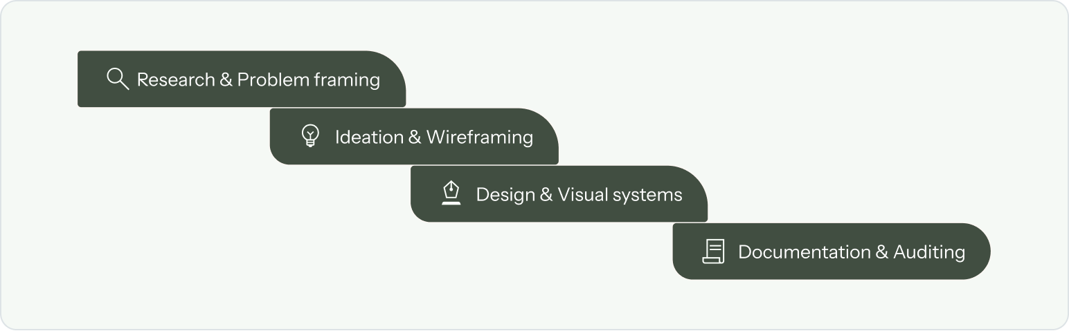
Mentored by Anushka Gokhale (Sr. Product Designer) and collaborating with cross-functional Research, Data and Tech teams, I led the user experience through four key phases.

Design process followed for the district data dashboard

*Gantt have a real project with clean cut phases

Making complex performance data readable

District performance metrics in India are siloed across multiple systems and scheme-centric platforms, making tracking slow and fragmented. Assam was selected as the first state to tackle this challenge.

The backend

CivicDataLab's data team was consolidating disparate scheme indicators into a single open-data pipeline.

My role

To design the front-end user experience and help structure raw metrics into an intuitive dashboard for easy browsing.

What do district officials need of their data?

Through the insights from our research and data science teams, we identified three core user priorities.

Block-level data analysis is essential to finding patterns and problems

Block-level data analysis is essential to finding patterns and problems

Information and data sources need to be transparent to establish trust in ideas

Information and data sources need to be transparent to establish trust in ideas

Periodic data updates needing quick checks and easy exports

Periodic data updates needing quick checks and easy exports

Mapping familiar design patterns

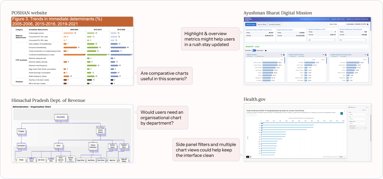
Beyond core functional needs, research showed that our users weren't very tech-savvy, meaning introducing new patterns could create steep learning curves. I benchmarked existing Indian and global dashboards to map the design patterns they are already accustomed to while also framing new questions about platform requirements.

Reference dashboard patterns mapped during the research phase

*Snippets of my notes from the mapping

Creating screens to test

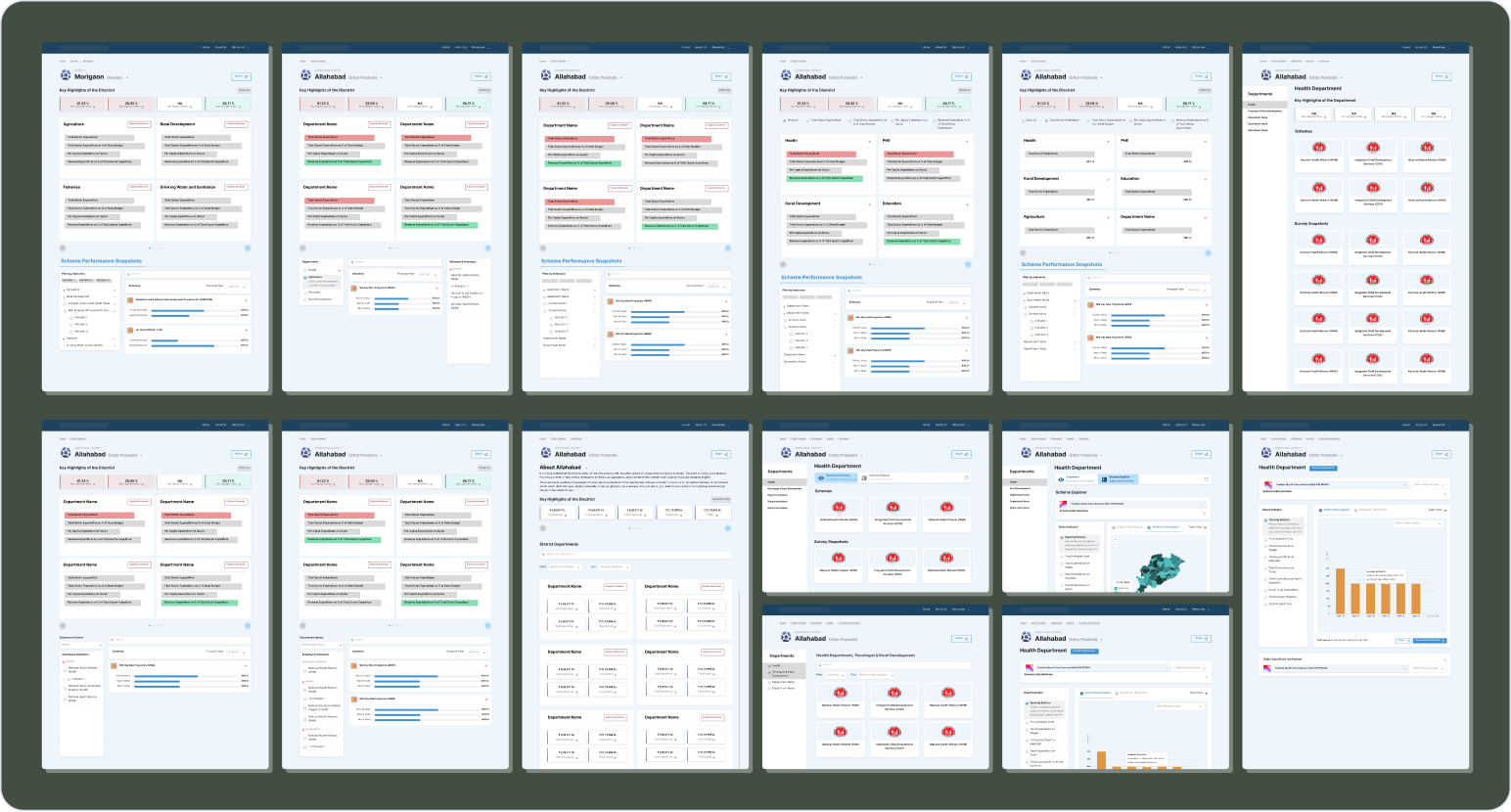
In a quick 3-day sprint, I explored multiple layouts and information flows to test directly with users and identify early friction points.

Wireframing exercise for the district data dashboard

*Wireframing for government products looks like small decisions with big impacts

Balancing user needs with MVP feasibility

Designing alongside an evolving dataset created a two-way feedback loop with the data team to align user desires with technical constraints.

Informing pipelines: UI concepts helped the data team understand what level of granularity was needed in sections like the overview.

Scoping phase 1: Technical limits helped trim complex features into the Phase 2 roadmap.

Defining the scope

Wireframe testing and user research pointed to four essential requirements.

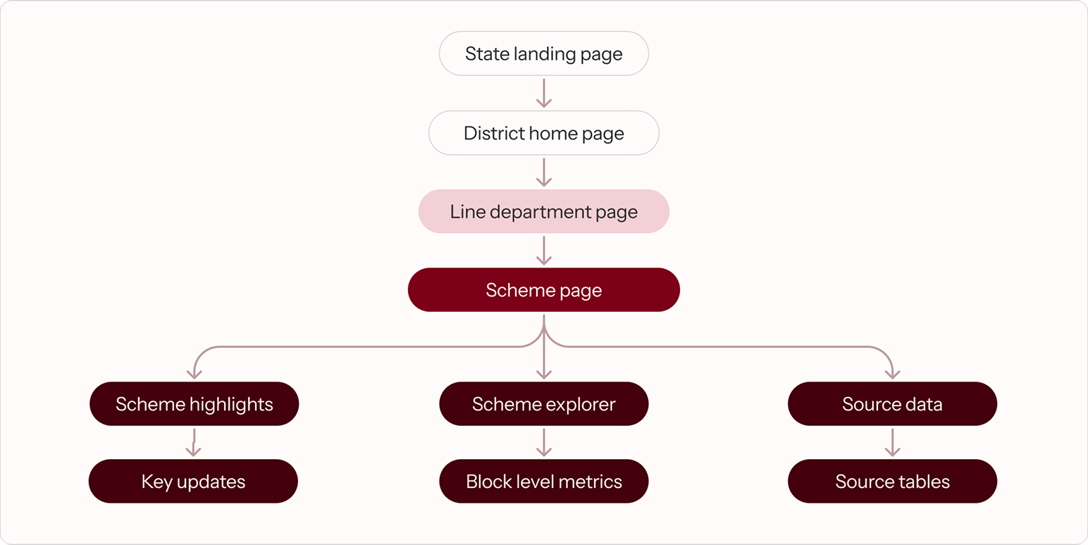
Drill-down hierarchy

State → District → Department → Scheme for clear, scalable navigation.

End-to-end transparency

Direct access to everything from key chart highlights to raw source data.

Mobile accessibility

A flexible interface designed for quick access whenever required.

Rapid reporting

Quick-glance progress updates paired with print options for internal meetings.

Mapping the information architecture

To build a foundation for the interface, I mapped an information architecture that followed a drill-down hierarchy based on the scope requirements.

Information architecture map for the district data dashboard

*A high-level view of the IA

The solution

Core problems discovered and how they were solved for.

1. How might we build a scalable structure that preserves granular, drill-down data?

  • Clear navigation structured from State → District → Department → Scheme helps handle multi-level data seamlessly.
  • Persistent sidebar on district views allows fast switching between departments without resetting context.
  • A Scheme Explorer view with granular block-level metrics makes analysis easier.

2. How might we provide users with easy-to-scan updates?

  • Key metrics and information are surfaced at every level — state, district, department, and scheme.
  • High-level summary cards deliver immediate status checks without forcing deep navigation.
  • Prominent “Last Updated” timestamps ensure officials know the freshness of their data.

3. How might we build trust through complete data transparency?

  • Direct CSV downloads for each scheme enable independent analysis.
  • Clean, print-ready page layouts are designed for offline reporting and official meetings.
  • Contextual tooltips explain metric calculations and link directly to primary data sources.

4. How might we ensure seamless data access for officials on the go?

  • A mobile-first design approach ensures that officials can access the dashboard from any device, anywhere.
  • Responsive layouts adapt to different screen sizes, maintaining usability and readability.
  • Quick-glance summaries and collapsible sections allow for fast navigation on smaller screens.

System audit highlights

Phase 2 backlog: Explicitly documented non-MVP features for future roadmap planning.

Design discrepancies: Cataloged UI variations between Figma specs and web implementation.

Validated assumptions: Tracked baseline design assumptions to guide upcoming user testing cycles.

Key component guidelines

Usage context: Detailed functional guidelines and state rules for each UI component.

Responsive rules: Documented layout adaptations and breakpoint behavior for mobile screens.

Team feedback loop: Captured insights from data teams and end-users to justify layout and IA choices.

What I took from this experience

As my first fellowship experience, having full end-to-end ownership taught me how to navigate real-world constraints, align with diverse stakeholders in product, data and tech, and take a product from 0 to 1.